08
TL;DRPartners decide in seconds whether an affiliate offer is worth it → two numbers and the sign-up form on the first screen, a short intro that shows the brand → a page designed and built by the same person, from 360 to 1920 px.
- Role
- Web designer and front-end developer
- Client
- LVLX · iGaming affiliate program
- Year
- 2025–2026
- Stack
- Figma, Next.js, React, TypeScript

In one paragraph
Design in Figma and a Next.js build for an iGaming affiliate program: the offer and the sign-up form on the first screen, a GSAP intro, and five exact screen widths. A landing page designed and built by the same hands, with the offer and the sign-up on the first screen.
Context
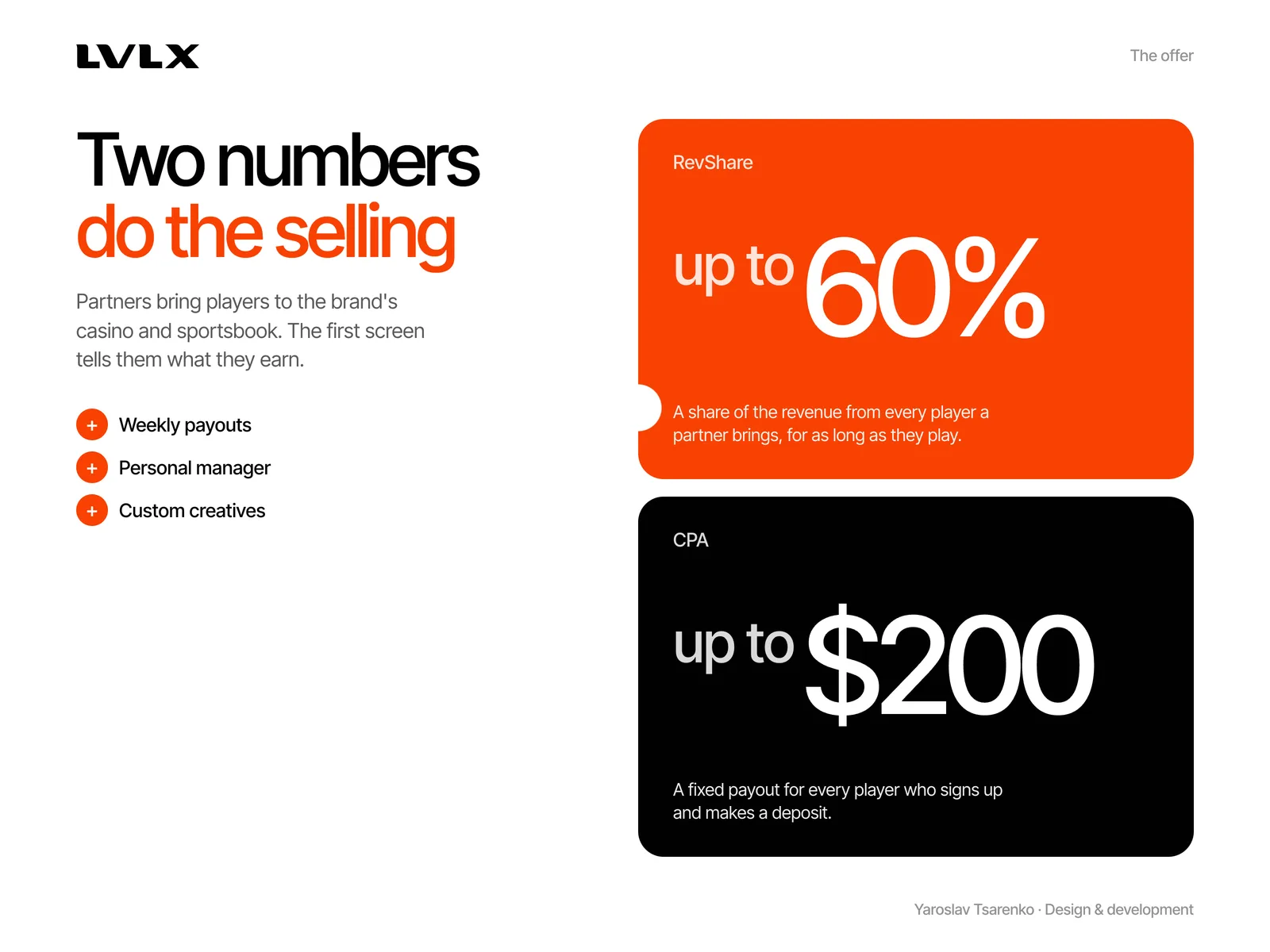
LVLX is an iGaming affiliate program: streamers, media buyers and site owners bring players to the brand's casino and sportsbook and earn up to 60% RevShare or up to $200 CPA.
Problem
The landing page has one job: turn that traffic into partner sign-ups, in English and Russian, on any screen.
What I did
- 01
Two numbers do the selling
RevShare up to 60% and CPA up to $200 are the first thing a partner sees.
- 02
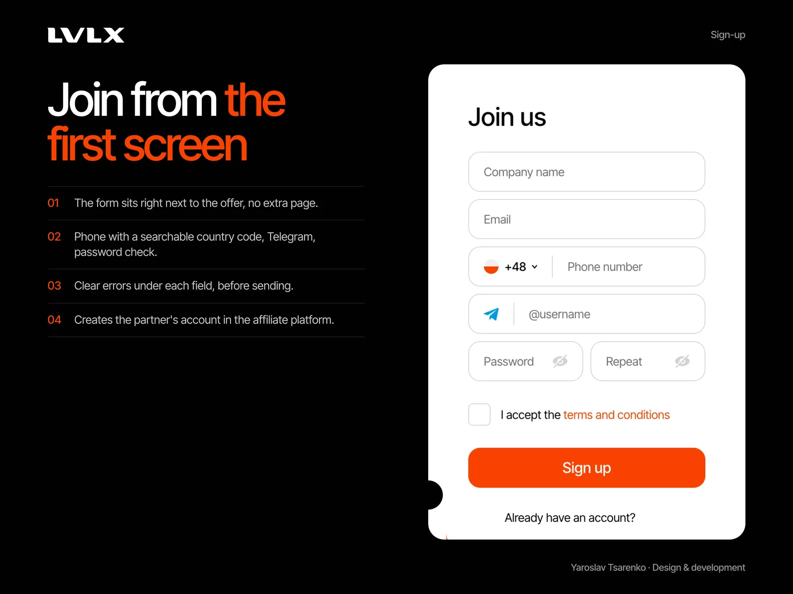
Sign up from the first screen
The form sits next to the offer: searchable country codes, Telegram, a password check and clear errors under each field.
- 03
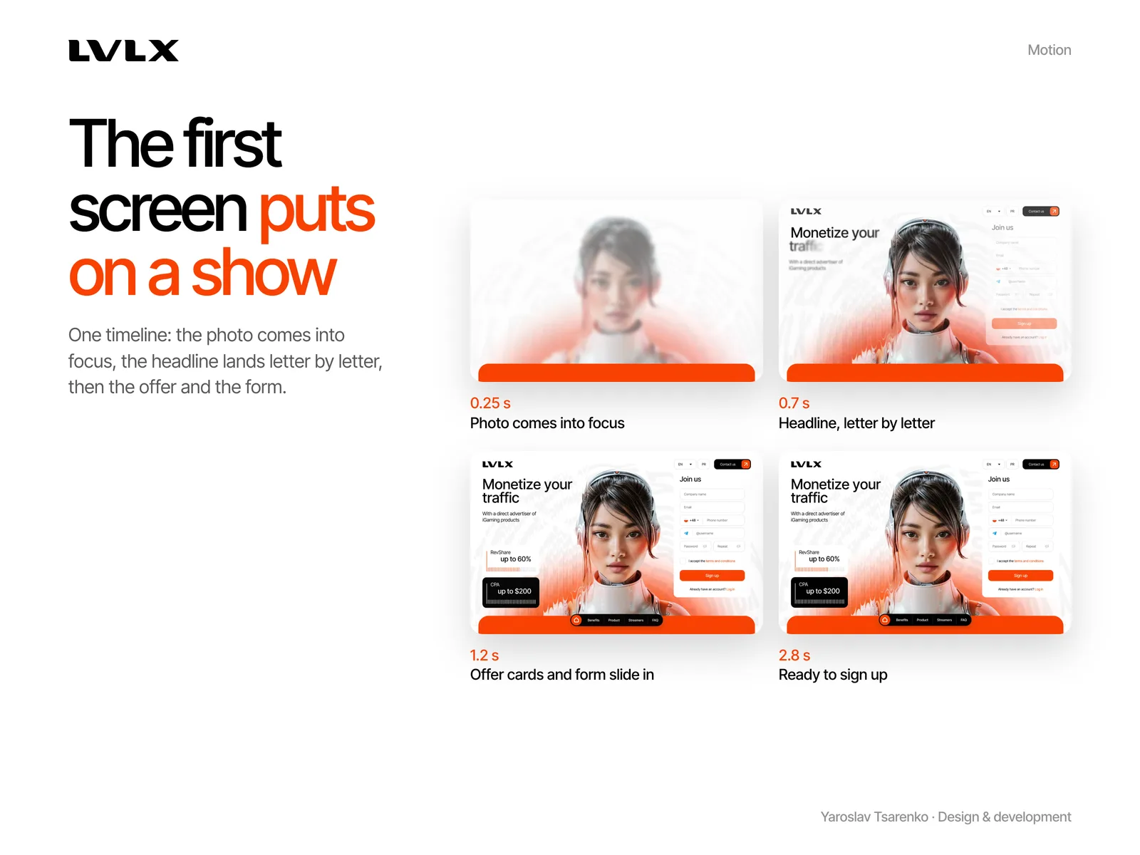
The first screen puts on a show
One GSAP timeline: the photo comes into focus, the headline lands letter by letter, then the offer cards and the form slide in.
- 04
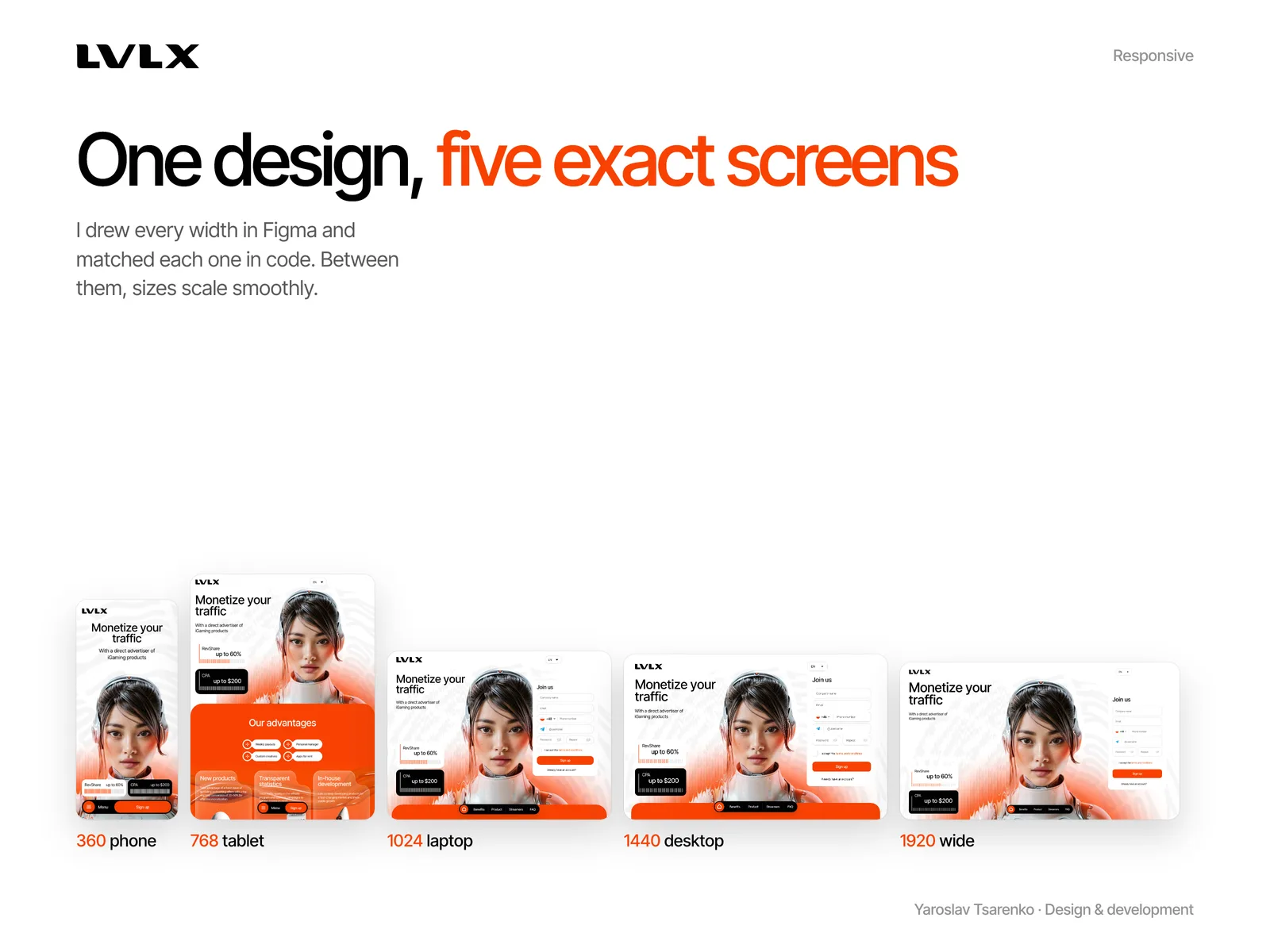
Five exact screens
Every width from 360 to 1920 px was drawn in Figma and matched in code, with sizes scaling smoothly in between.
Results
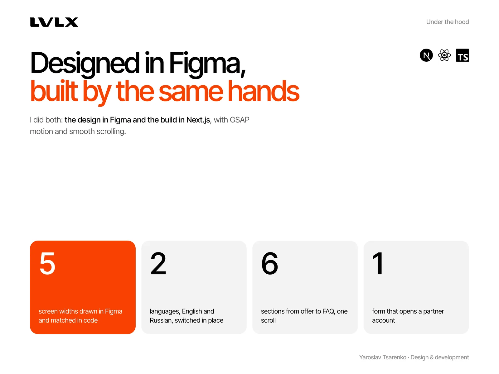
5
screen widths drawn in Figma and matched in code
2
languages, English and Russian
1
form that opens a partner account
Stack
- Figma
- Next.js
- React
- TypeScript
- GSAP